March 28, 2025
/
Design Language
The power of neutral palettes.

Color that creates calm
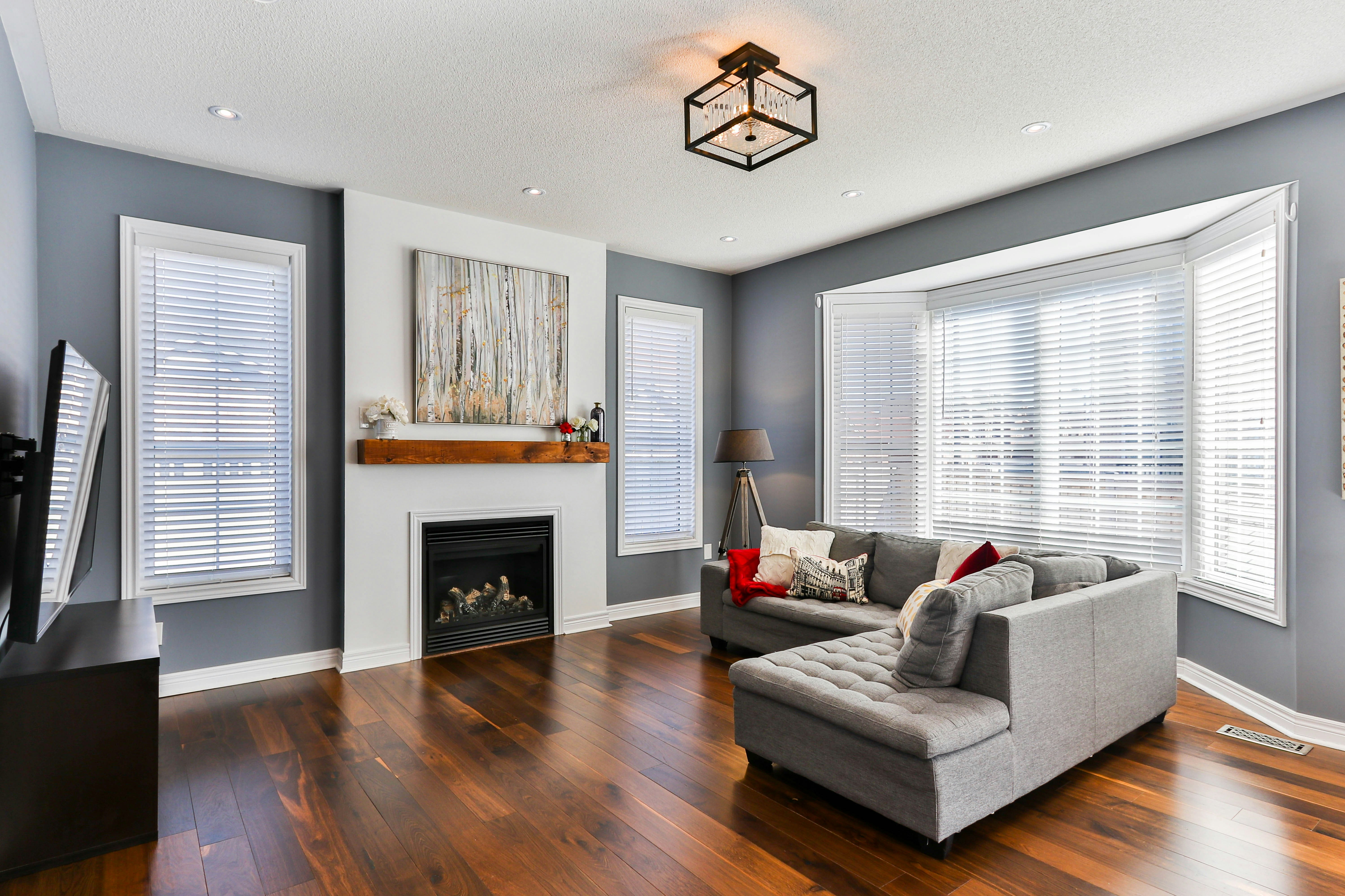
Neutral palettes are often underestimated — mistaken for plain or safe. But when used with intention, neutrals can be powerful. They create space to breathe, allow textures to shine, and bring a natural sense of balance into your home. More than just a backdrop, a well-layered neutral palette can become the soul of a room.
Why neutrals work so well
Neutrals provide clarity. They don’t demand attention — they hold it gently. Whether you’re designing a small apartment or an expansive family home, a neutral color story creates cohesion, softness, and light.
They make spaces feel larger and lighter
They highlight texture, shape, and shadow
They allow room for subtle contrast and layering
They support rather than compete with personal items and decor

“I never knew beige could feel so rich until I saw how much depth it adds when layered right.”
How to layer with depth, not dullness
The key to a strong neutral palette is variation — not in color, but in material. Think warm woods against soft textiles, matte finishes paired with stone, or sheer curtains that catch the light just right. These choices add dimension without overwhelming the space.
Layering neutrals is a quiet kind of design — thoughtful, deliberate, and deeply livable. When done well, it doesn’t feel empty. It feels calm, complete, and effortlessly timeless.
Related posts.
Ideas, insights, and inspiration — curated for design lovers.


Let’s work together
Ready to begin or need guidance? The Interior team is here to help you design your space.
Let’s work together
Ready to begin or need guidance? The Interior team is here to help you design your space.
Let’s work together